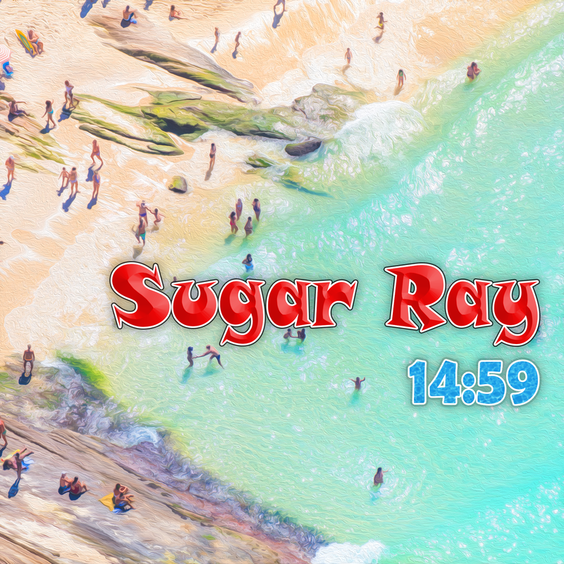
This started out as a sort of flyer, but ended up an album cover. I felt that I didn't have quite enough information to make it a fully-formed flyer. I experimented with a few background photos of beaches to begin with, applying filters and effects to make the information simpler while emphasizing the colors. The oil paint filter is the main effect I used, it does this really well. I decided that this one was the best to support the composition I had in mind, with the text aligned on the side. The water provides a nice clean background for the words, and I like the color I got out of it. I made a simple water pattern from a stock photo to apply to the album title, and created a layer style for "Sugar Ray". I tried to make the composition a little more interesting by not putting the title at the top and not making it horizontally centered. I think it makes it a little more unified with the background.